SCA Health

Strengthening the market presence of a $3 billion Optum entity that leads the U.S. in outpatient surgical services.

Client
  • Optum

Sector

SCA Health is a major player in outpatient surgery – boasting a $3 billion operating unit of Optum, and is a subsidiary of UnitedHealth Group, who acquired it from TPG Capital. Simply put, they partner with health plans, physician groups, and health systems to develop and optimize surgical facilities.

As they acquired their own subsidiaries, SCA Health recognized the need to rebrand. We saw the opportunity to establish SCA Health as more than just an ASC management company, but a brand transforming the future of specialty care for the patients and communities they serve.

Our team reimagined their brand message with several key considerations: determining how three core services impact messaging, establishing strong B2B and B2C segmentation under one unified messaging strategy, and identifying SCA’s position within Optum’s brand architecture.

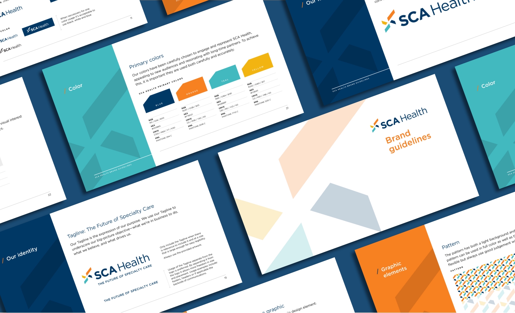
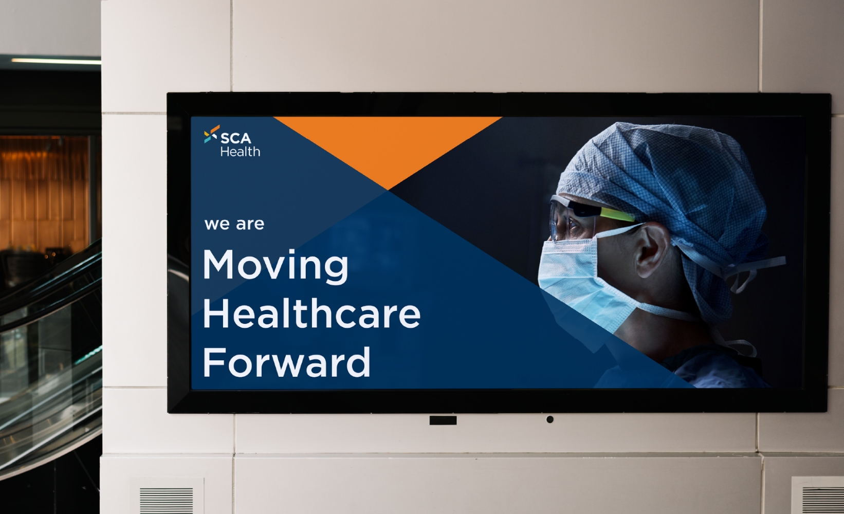
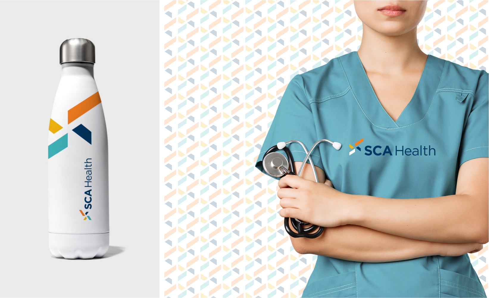
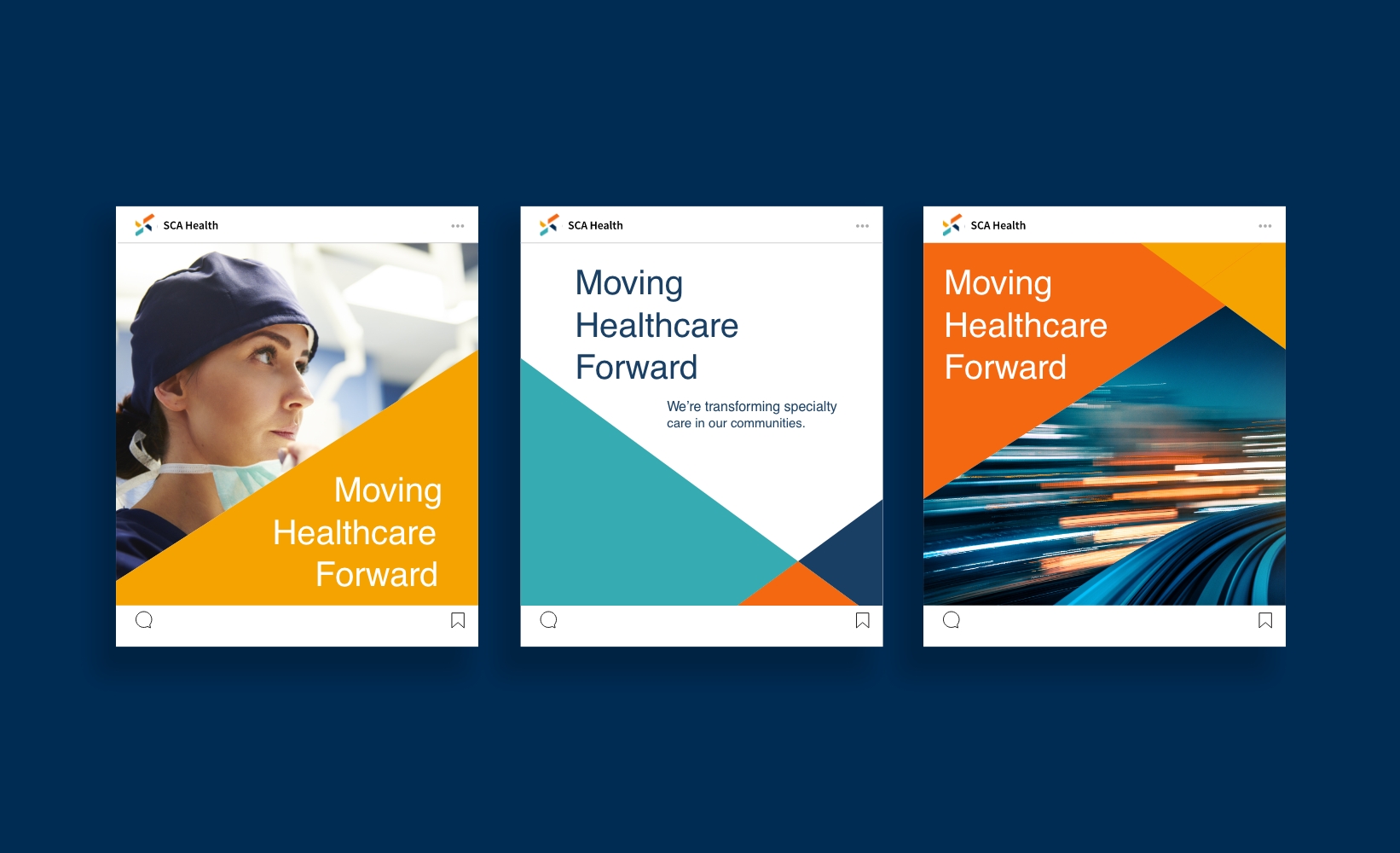
The scope of deliverables included naming, brand architecture, brand story, and messaging, an entire visual identity system, brand manual, and roll-out. In addition, we created graphics and signage for two major annual health conferences, helping SCA Health launch their biggest brand overhaul in front of the industry's largest stakeholders.

In the end, we took a multifaceted brand and its collection of subsidiaries and unified them under one brand purpose: transforming the future of specialty care.

A geometric abstract design featuring intersecting diagonal lines forming a diamond pattern. Within the pattern, there are four colored kite-shaped sections: orange, yellow, blue, and teal, set against a black background.

SPARK ICON

The symbol conveys the relentless passion and momentum of SCA Health, depicting a spark of innovation that’s constantly igniting new ideas. The longest parallelogram signifies elevated vision and direction in the surgical care industry. Momentum, energy, and illumination, also integral pillars of SCA Health, are represented by the other three.

Image showing multiple pages of branded materials for SCA Health. The pages highlight primary colors, logo design, brand guidelines, and a section titled The Future of Specialty Care, featuring various text and graphics in blue, orange, and white.
Various SCA Health Icons.
A digital display shows a healthcare professional wearing a surgical mask, cap, and goggles. The text reads SCA Health: We are Moving Healthcare Forward on a geometric blue and orange background.
A stainless steel water bottle with a colorful geometric logo and SCA Health text is on the left. On the right, a person in teal medical scrubs, holding a stethoscope, stands in front of a patterned background with the same logo.
Three digital posters for SCA Health with the slogan Moving Healthcare Forward. Left: healthcare worker in scrubs; Middle: geometric design; Right: motion blur of speeding lights. Each features a unique background and design layout.

You might Like

#
Corporate Healthcare Services
Life Fitness
#
Corporate Software & Technology
Sensata INSIGHTS